Posts

Showing posts from September, 2018

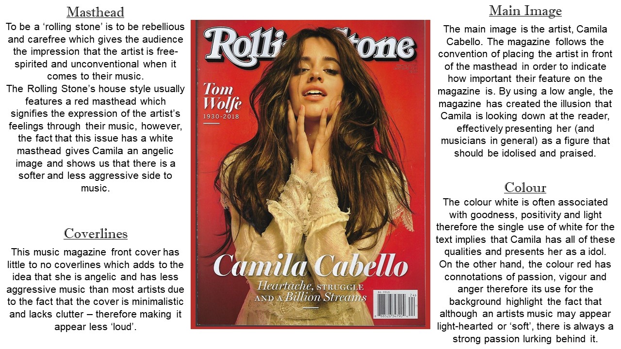
Exploring Music Magazine Typography

Image
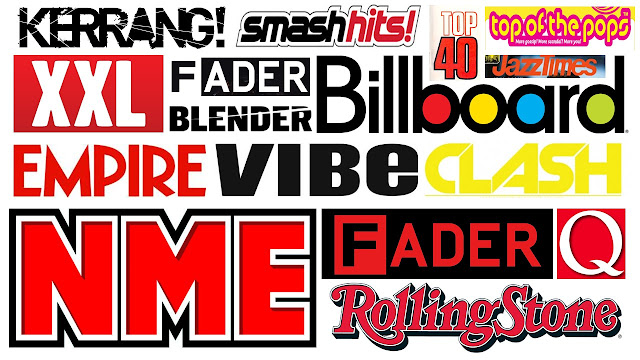
The Kerrang masthead is black which connotes seriousness and something that has solemn and dark attributes to it. The capitalised font (along with the exclamation mark)  make it seem as though the word is being shouted which reflects their rock and metal genre as rock music is often labelled as loud, aggressive and chaotic. On the masthead, there are white lines which mimic the appearance of a shattered mirror signifying the fact that not only does the magazine break conventions, but it also doesn't pay mind to it's appearance or how it viewed by others. Billboard uses a sans-serif black font which has red, yellow and blue circles within the letters. This gives the magazine a more modern and artistic feel to it as opposed to Q or the 'Rolling Stone' which appear more vintage and serious. The colours reflect the pop genre of the magazine and as they are the primary colours, it provides the magazine with an air of importance as it implies that they are the root of

Music Magazine Deconstructions

Image
As a part of my research into music magazines, I must explore the different elements  and conventions of a music magazine in order to understand why and how certain aspects of mise-en-scene reflect a magazine's target audience. Here, I have deconstructed an issue of 'Rolling Stone' magazine and an issue of 'Uncut' magazine.

Brief Outline

For my brief, I’ve been tasked with conducting research and producing the front cover of an original music magazine along with a double page spread featuring the artist. During the prelim, I learned how to use Adobe Photoshop to construct my fashion magazine and I enjoyed using the program therefore I am excited to use it for this magazine. I’m also looking forward to developing my Photoshop skills, specifically when it comes to editing the main image and manipulating other aspects of the magazine. In my opinion, there is a greater diversity within music magazines as opposed to fashion magazines thus I think there will be a far more interesting variety of real products to use as prompts and inspiration when I am conducting my research. As this NEA is a time-sensitive project, I will aim to put more time outside of lessons during the production of my magazine as I think it will give me more opportunities to better my product. I also want to create more resources for