Posts

Closed Blog Notification

Centre Name: Norbury Manor Business and Enterprise College for Girls Centre Number: 14343 Candidate Name: Nivea Makinde Unit J200 Creating Media

Final Products

Image
Here are my final products; my front cover and double page spread

Test Shots

Image
In media products, different shots are used to reflect different ideas and genres. Most real life music magazines use medium closeups and closeups due to the fact that it allows the facial expression of the artist to be comprehended by the audience For my own magazine, I used a medium close up where my model is looking directly at the camera. This would engage the audience and subsequently draw them to the artist. Shots where my model is looking away from the camera were used as I wanted to subvert the conventions of angle of gaze, however, this would present my magazine's theme as rebellious which is not what I wanted. My theme is simplicity and naturalism hence why my model isn't wearing any make up and why there is minimal mise-en-scene. There is very little mise-en-scene in my shots as the theme of my magazine is simplistic therefore I used a simple white background - this would also be easier to manipulate in Photoshop. The model's poses are

Model Consent Forms

Image

Flat Plans & Deconstructions

Image
These are the flat plans for my music magazine front cover and double page spread: I plan for the strapline 'Music Magazine of the Year' to be on top of the masthead and I will also make the masthead larger so that it sits behind the models head. I also plan for the feature colour to be used on the anchor on the front cover to present my artist as a selling point. The artists name runs vertically on both the front cover and double page spread to subvert the horizontal convention The style of my article will be a blend of a review and an opinion piece. During my focused audience research, one of my participants stated that they would rather learn about the mundane attributes of the artist such as hobbies and preferences rather than the generic ‘why they enjoy music’. My other participant claimed that they would prefer to read about how the artist is feeling in the music industry and whether there are any deeper meanings embedded into their albums thus I think t

Statement of Intent

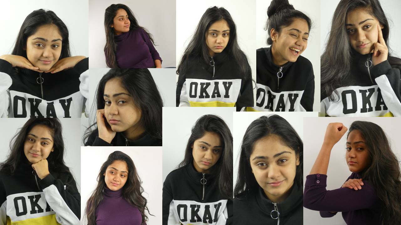
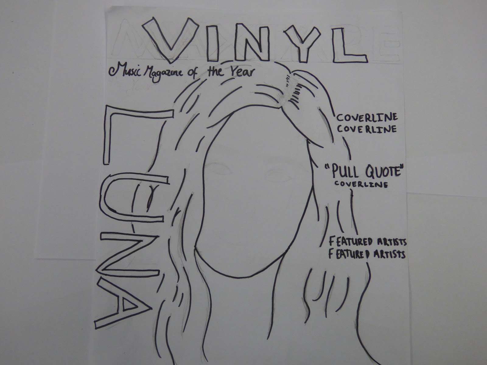
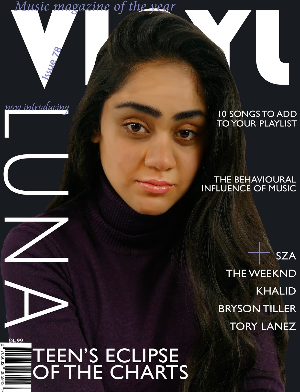
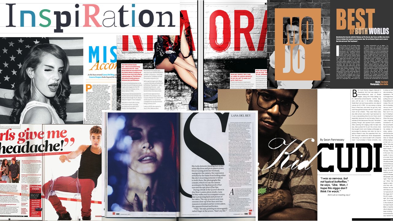
I intend to construct the front cover and double-page spread of a music magazine aimed at 14 to 18-year-olds. I have chosen the name ‘Vinyl’, stylised in sans-serif, for the title of my magazine, as the main genre of my magazine is contemporary which has elements of old-school music. My media text is best suited for those who want to discover new and upcoming artists who break away from the conventional sound of ‘R&B’. My audience have a strong appreciation for meaningful lyrics and although they wouldn’t necessarily be familiar with everything within the genre, they would be open-minded to discover it. I intend to have my model gaze directly into the camera so that she is presented as brazen and confident – a trait that appeals to my audience as found in my focused audience research. My typography will be simple and sans-serif as I think it presents my magazine as relaxed and will endear my audience, who are young, as opposed to strictly serif fonts. I plan to use pre

Double Page Spread Moodboard

Image